
Case Study
Degreed.com Redesign
Modernizing Degreed’s marketing presence for two distinct audiences.
User Research; UX Design; Visual Design; Client Management
Project Overview
For several years, the Degreed.com marketing site had not been fully redesigned. Various pages throughout the site had been updated, such as when Degreed Skill Certification was announced, but overall the entire site was a hodge-podge of visual styles, disparate elements and dead-end user flows. In late 2017, the decision was made to start investigating a redesign and rearchitecture of the site. Given my experience with information architecture, consumer web design and user research, I was chosen to lead this redesign effort, collaborating with not only product management, engineering and other product designers, but also the product marketing and brand teams.
Project Timeline: 3 months
Team: Senior Product Designer (me); 1 Product Manager; 2 Engineers; QA; 1 Product Designer; VP of Product Design; VP of Brand
Information Architecture/Site Map
Existing site evaluation
When beginning the project, my first priority was determining which pages from the existing site would be kept, which could be migrated or combined into new pages, and which should be retired. To do this, I first created a site map diagram of the existing site to catalogue all existing pages as well as illustrate the lack of user flow within the site.
Hierarchical Site Map of Degreed.com as of August 2017 (Click to enlarge.)
Site Map Proposals
From there, I was able to determine some of the biggest user flow issues, such as dead ends and unlinked pages, within the site architecture, and propose several solutions for improvement. Each of these proposals was based on a potential focus for the marketing site.
Site Map Option A - Split Audience
Site Map Option B - Consumer Focused
Site Map Option C - Enterprise-Focused
Site Map Option D - Product Offering Focused
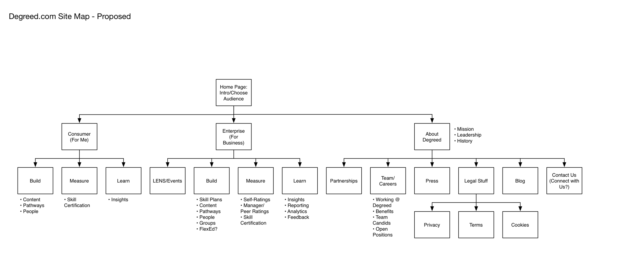
Final Proposed Site Map for Degreed.com Redesign
Final Proposal
These solutions were then brought to stakeholders, including C-level management, for discussion and evaluation against Degreed's desired market positioning to determine the final proposal.
In the end, a "Split Audience" site map, wherein the user is asked upfront to choose their desired experience, was determined to be the most in line with Degreed's philosophy of supporting individual learners as well as enterprise SaaS customers, as well as not selling solely on feature lists, but on user experience and helping users to reach their goals.
iPad Sketching
Once the information architecture/site map was determined, I began sketching potential layouts for the Degreed.com homepage, as well as explorations for navigation paradigms. Ideally, I wanted the navigation to closely mirror the patterns already existing in the Degreed platform, so I stayed very close to those visually while exploring ways to seamlessly incorporate calls to action (such as Log In and Sign Up) within the header.
Homepage + Navigation Exploratory Sketches
Navigation Exploration
User Testing: Visual Explorations
At this stage, the VP of Product Design suggested that I start creating a visual language and design system for the new site. Speaking with other designers on the team, though, highlighted that there were many different opinions as to what the visual language should look like. Being more of a back-end UX designer, I felt less opinionated about the visual direction of the site personally, and favored using user research to help determine the look and feel. As such, I asked three designers -- a Product Designer, the VP of Product Design and the VP of Brand -- to each create a version of a Degreed.com homepage in the style of their choosing.
I then took each of the three visual design treatments and used UserTesting.com to compare them in a remote, unmoderated user test. I asked a total of 15 users (split between A vs B, B vs C and A vs C, with the order in which each was shown to a user randomized to eliminate recency bias) to give their first impressions of the visual styling, then evaluate which of the two designs they were shown was more "Bold" and which was more "Trustworthy."

In the end, each of the three visual styles had its own merit -- B was most "Bold" while A was most "Trustworthy;" C was most easily understood and users liked the amount of white space. And so I iterated on a combination of the three to create a cohesive design language.
Creating the Main Pages
Once the visual design language was established, I began working on laying out the first three pages we intended to release: the homepage, For You (consumers) and For Business (enterprise buyers). Throughout the process of designing these pages, I worked closely with the VP of Product Marketing to iterate on messaging and copy, and with the VP of Product Design to ensure quality. The Brand Marketing team was ultimately responsible for photography assets for the pages, while I was in charge of editing them to make them web friendly (responsive, compressed and retina-ready).
Homepage
For You (Consumer)
For Business (Enterprise)
Additional Pages
Once the three main pages had been released, it was then time to focus on updating the rest of the site to match the new look and feel. Over the course of the next few months (Degreed practices 1-month long sprints), the remainder of these pages were released, with the final page (404/500 Error Page) releasing in July 2018.
About Page
Contact Us Page
Careers Page
404/500 Error Page